Vodatechnik confirms that investing in a professional visual identity pays off even for a smaller company. A clear and consistent look boosts credibility, facilitates sales and helps a company stand out from the competition.
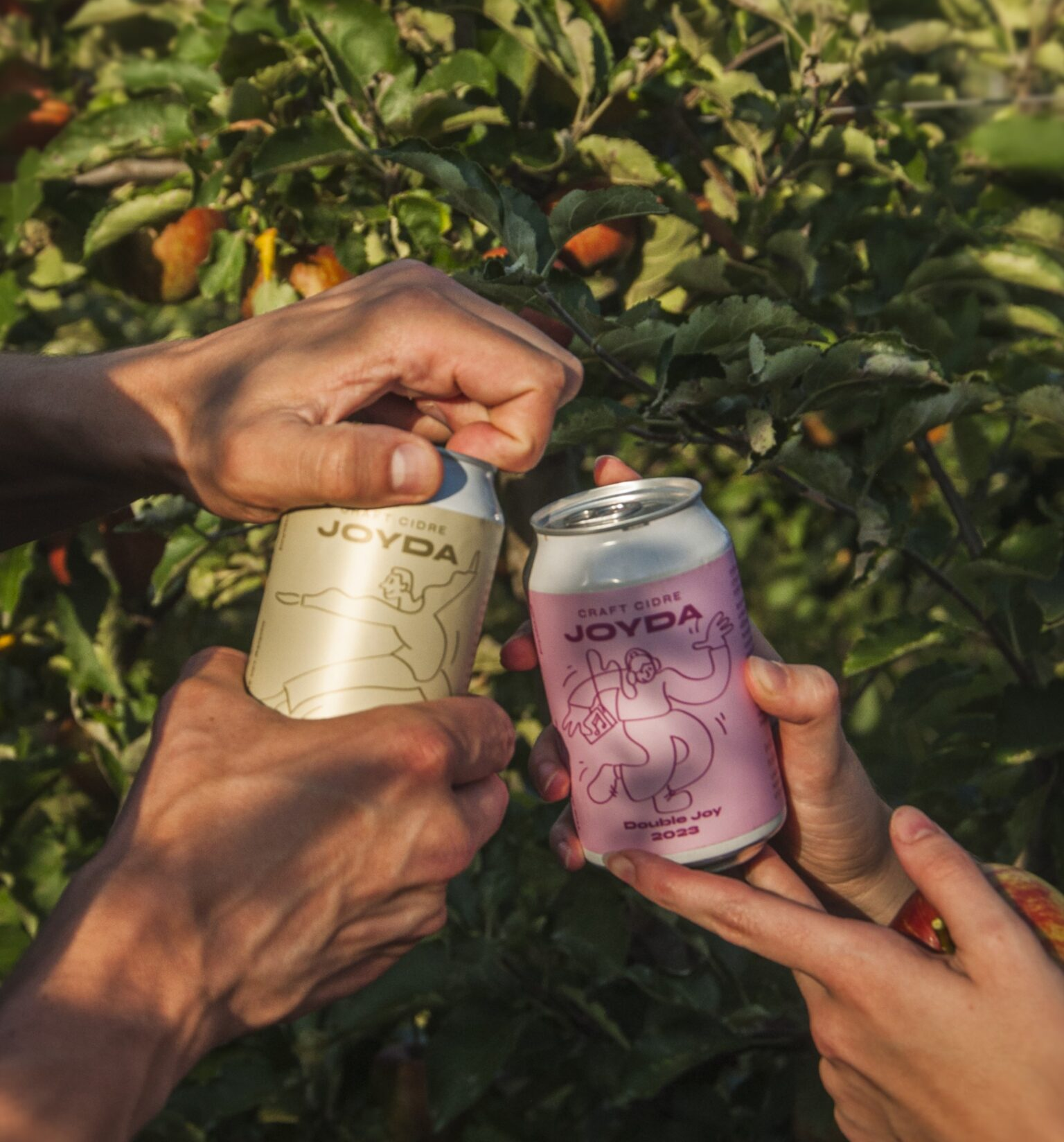
In the redesign, we followed the original logo and corporate colours, which we simplified into a modern symbol - the combination of a drop of water and a leaf refers to both purity and sustainability. We added new typography and a colour palette to make the brand feel simultaneous and easy to use across all media.
This tightly built visual system allowed us to design a lightweight, responsive website and uniform fleet wraps. The brand remains recognizable at every customer touchpoint - from business cards to social media to vehicles.
The result? The company operates more professionally, builds trust more quickly and can offer its services at an appropriate price. The investment in identity pays off in the form of higher sales, easier marketing and a clear visual direction for future growth.