CSAG
We designed a complete visual identity, website and print materials for CSAG, a company focused on green hydrogen production and the development of sustainable energy solutions. Our goal was to clearly and clearly present a brand that combines cutting-edge technology with an environmentally responsible approach. The basis of the new identity is a clean geometric logo with a bold green color, inspired by technical precision and molecular symbolism. The minimalist style and carefully balanced proportions [...]
Vodatechnik
Vodatechnik confirms that investing in a professional visual identity pays off even for a smaller company. A clear and consistent look boosts credibility, facilitates sales and helps a company stand out from the competition. In the redesign, we built on the original logo and corporate colours, simplifying them into a modern symbol - the combination of a drop of water and a leaf refers to both purity and sustainability. We added new typography and a colour palette to make the brand feel simultaneous and easy to use [...]
Together in real estate
Pavel Mrazek

We successfully set up a new visual identity for financial advisor Pavel Mrázek. We created a simple logo that mirrors our client's professional and trustworthy approach. We designed a minimalist website that makes browsing the content easy and intuitive. The business cards are then the perfect complement, standing out for their simplicity and elegant design. Overall, we focused on the use of thin lines and minimalist elements that together create a harmonious and modern overall impression.
CM Funeral Service

This was a great challenge! Before designing the website, we went through the first 30 funeral service pages on Google and found that creating a fresh website for the funeral industry was not going to be easy. Funeral services often use funeral colors, black and white photos, and multiple font combinations. Plus, they often suffer from non-responsiveness, making them hard to display on mobile devices. Funeral service websites look like something out of a horror movie - they're full of crosses, [...]
Bagruj snadno
Our studio was happy to take care of the visual style of our client Bagruj-snadno.cz. In addition to the logo, we carefully selected and matched the colours to make the overall visual impression both pleasing and believable. Fresh colours are the key to a light and modern impression. We designed the website to be simple to use and appealing to visitors, ensuring an optimal user experience. We are proud that our work [...]
Bohemia
For Bohemia, a company that imports Czech crystal to Iceland, we have embodied the essence of premiumism and craftsmanship into a new visual identity. Our design reveals the story behind each cut facet - from its historical roots in the heart of Europe to the icy shores of Iceland. A delicately balanced palette of dark blue with a touch of classic elegance draws attention to the very name Bohemia, which is etched in memory as synonymous with the highest quality. In every [...]
Tana school
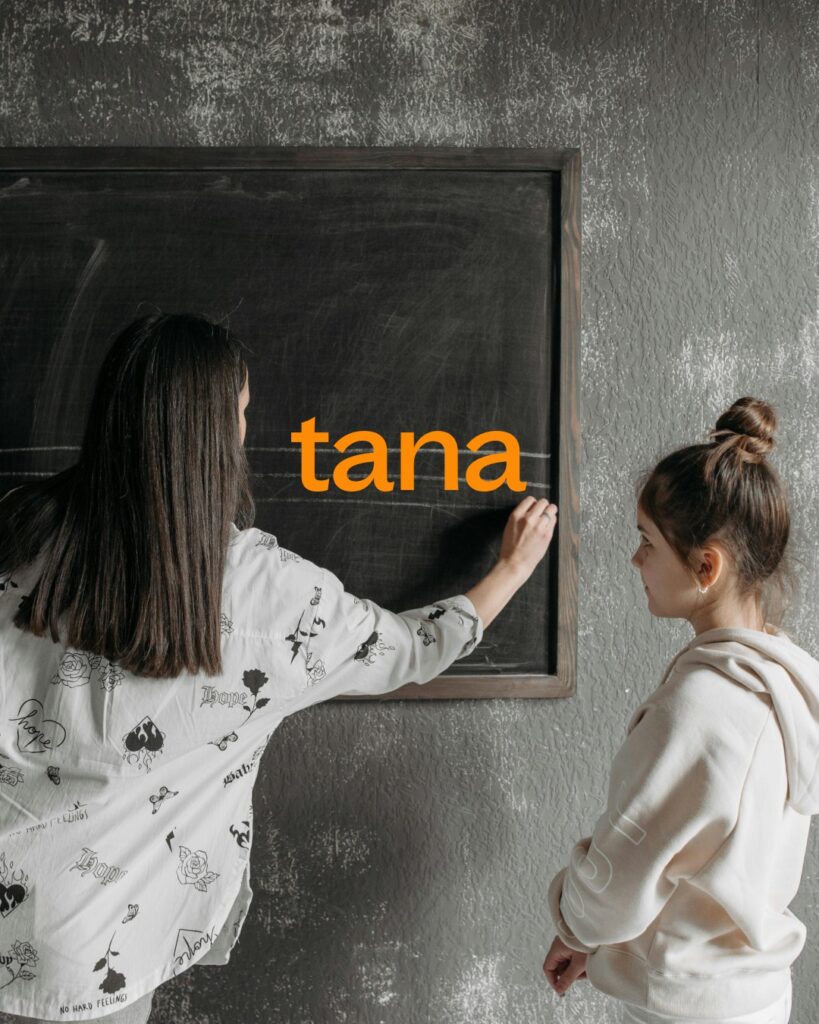
Our studio prepared a new rebranding for Tana, a company that specializes in the sale and installation of school boards and furniture. As part of this rebrand, we designed a new logo that transitions from the original bold style to a more modern and minimalist one. One of the key elements of the new visual identity is the children's doodles, which were chosen as the branding element. This unique element aims to improve recognition and bring playfulness and originality to the communication. [...]